
Picture the logo of the Church of Jesus Christ of Latter-day Saints. You're probably thinking of this:
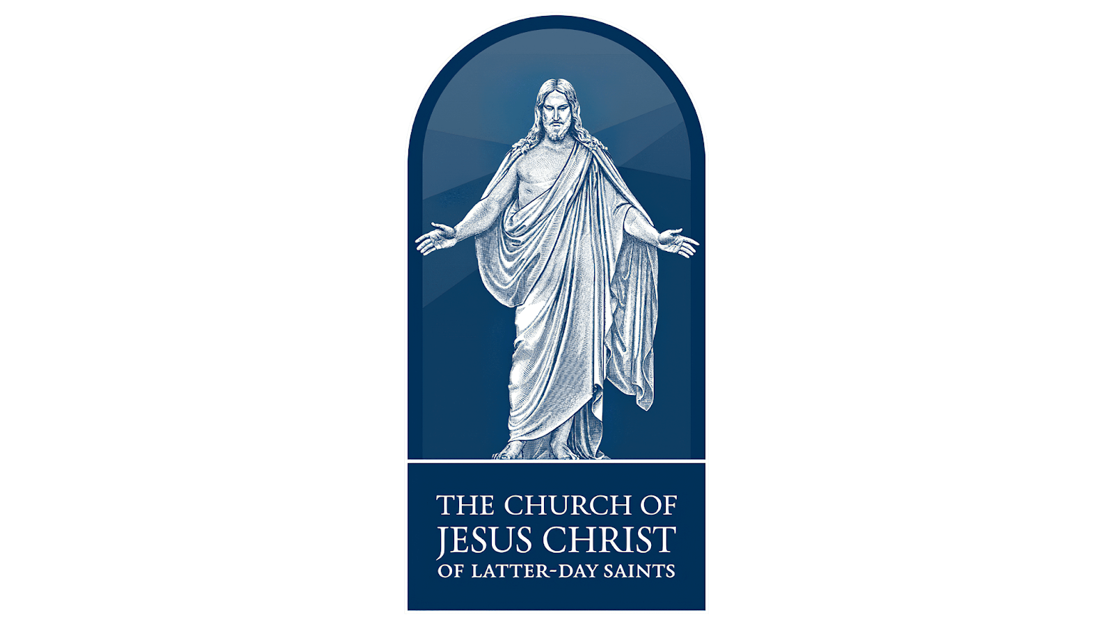
Great logo. Sleek. Easy to read, even at a distance. Beautiful serif font. Emphasis on Jesus Christ. Everything you could ever want in a logo. But it wasn't always that way. In fact, for most of The Church of Jesus Christ of Latter-day Saints' existence, there was no official logo at all.
You may find yourself thinking, "This is the most boring topic I've ever heard." Maybe you're right, or maybe you'll be surprised! The Church's logo isn't one of those things many give much thought to. But from its beginnings in an era before logos to the modern, readable version we see today, the Church's logo and graphics have been quietly evolving over the years, reflecting the Church’s growth, priorities, and identity.
What even is a logo?
Before we dive into the history of the graphics that have represented the Church to the world, we might want to understand some basic graphic design terms. Here are a few to start:
Typeface: the overall design of a set of letters, numbers, and symbols, like Helvetica or Times New Roman
Font: a specific style and size of a typeface, like Arial Bold 12pt
Logo: a graphic mark, emblem, or symbol used to aid and promote public identification and recognition of a brand or organization
Wordmark: a text-only statement of the name of a product, service, company, organization, or institution, which is used for purposes of identification and branding
We’ll also pick up a few more terms along the way.
1838–1974: The Wild West of Design
When the Church was officially established, logos weren't even a thing yet. Most organizations—religious or otherwise—simply printed their names in whatever typeface the local printer happened to have on hand.
When Joseph Smith received the revelation in 1838 that gave the Church its name, George W. Robinson scribed both the revelation and the first recorded instance of the Church's name.
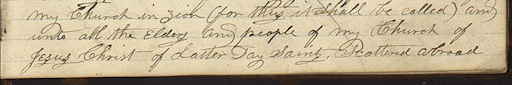
If we cleaned it up, it might look something like this:
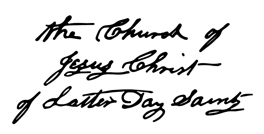
Interestingly, if the Church had ever decided to use this as an official logo, it would be called a "signature logo." As the name suggests, these logos are most commonly based on the signatures of individuals, like Walt Disney. They can also be any logo based on handwriting, like Sharpie, Virgin Media, Barbie, or Ray-Bans.
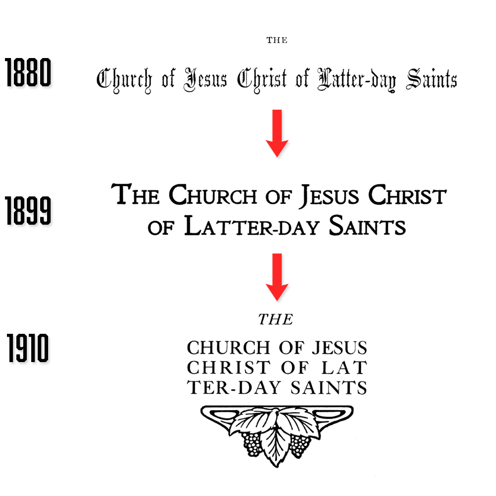
The Church, of course, never used this as a logo. Until the end of the nineteenth century, most businesses didn’t even have logos, let alone churches. Printed materials and signage from this period featured the Church’s name in a wide variety of fonts and styles—some elegant, others more eclectic.
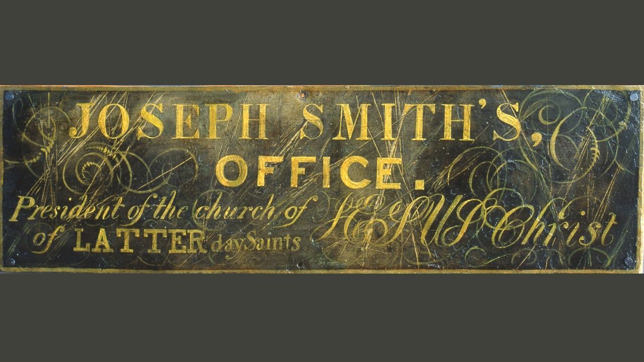
At this time, and for more than a century after its organization, the Church operated without any standardized visual identity. We don’t have to look any further than a random selection of officially published General Conference reports.
This was also the era of what you might call "graphic design freedom"—every stake, mission, and publication doing its own thing. For example, this meetinghouse in El Paso, Texas, built in 1930, featured the Church's name in a font and formatting close to the modern logo.
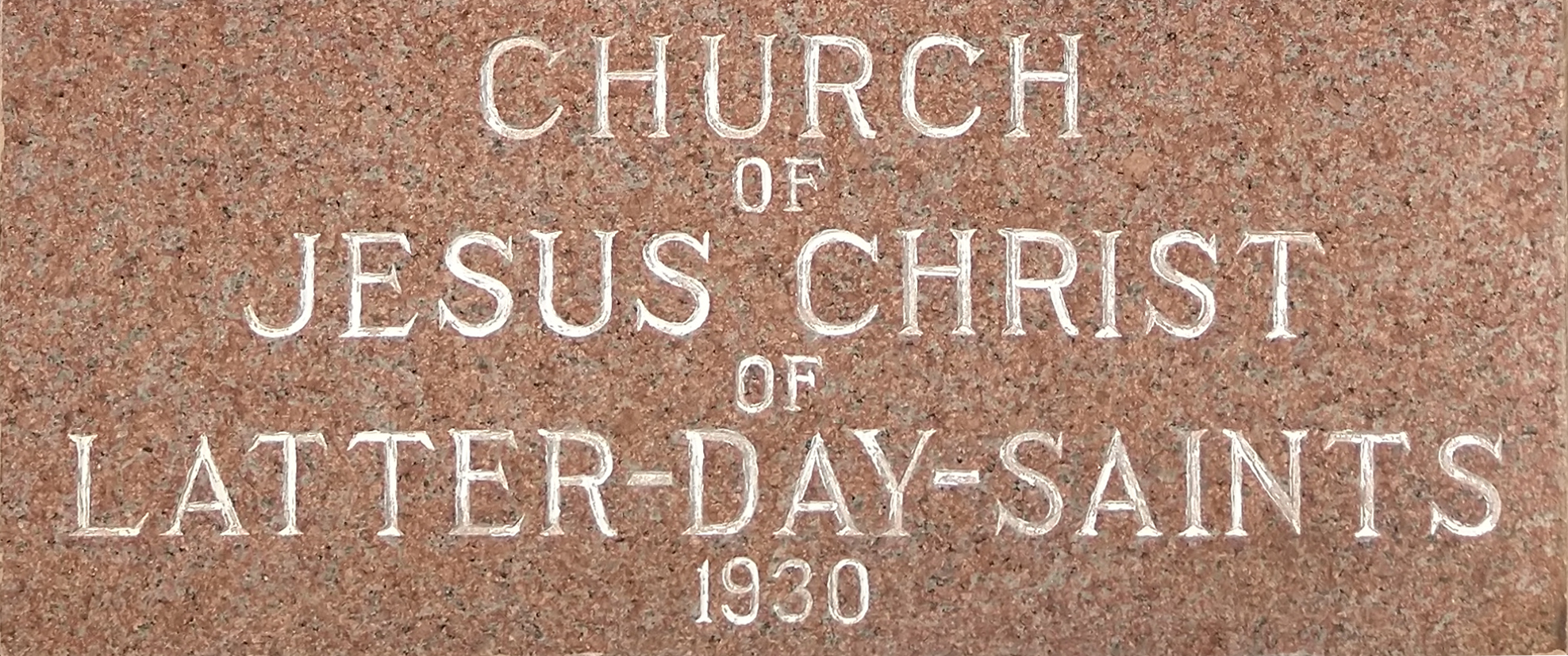
During this period, the aesthetics of Church buildings and publications reflected the tastes and resources of local leaders and members more than any centralized design philosophy. Ward members would often fundraise for their own chapels, source the plans, and often even help build them themselves.
1974–1995: The Rise of Correlation
By the 1970s, the Church was experiencing explosive growth worldwide. Leaders seemed to recognize that a consistent visual identity could help strengthen the sense of unity in a global church.
Enter the Church's first standardized wordmark logo in 1974. If you're over 40 (or just meet in a Church building from the era), you probably remember it well. Designed by Randall Smith and his team, the logo featured the Church’s name in a modified version of the Baker Signet typeface, a classic serif font chosen for its readability and professional appearance.
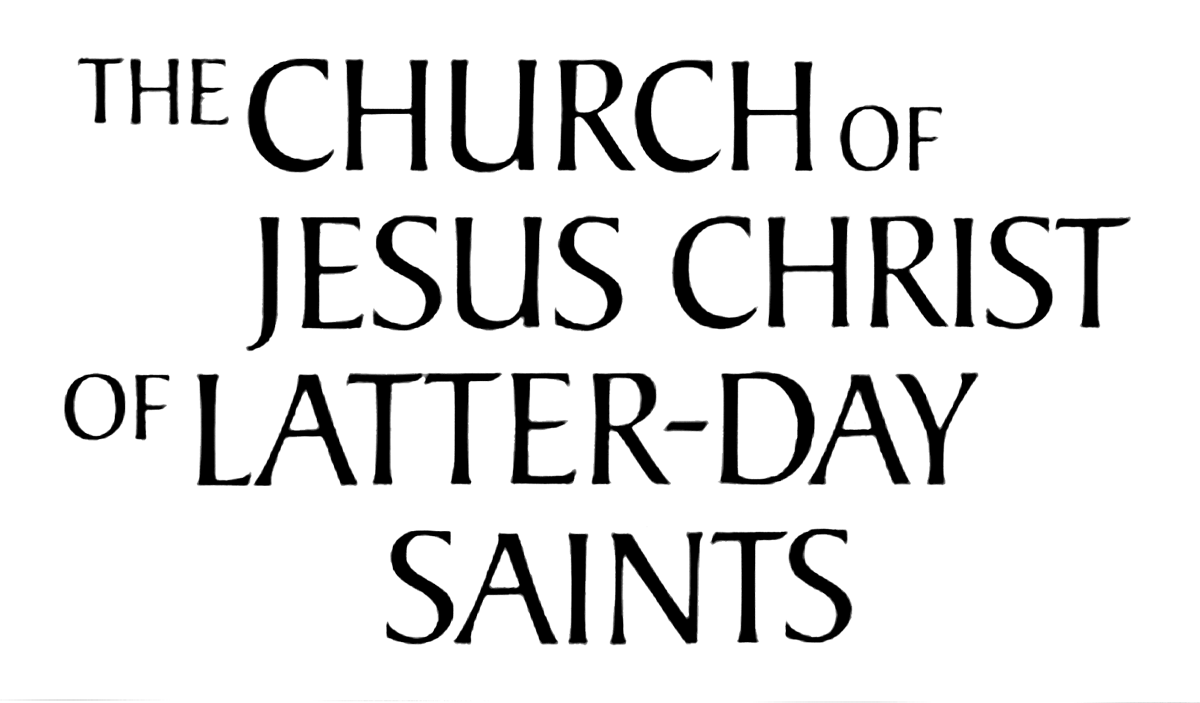
This logo appeared during the broader correlation movement within the Church, when leaders were standardizing teaching materials, streamlining programs, and establishing more consistent procedures worldwide. The logo was just one visible aspect of this larger shift toward unity.
For over two decades, this logo served as the Church’s visual hallmark. However, by the mid-1990s, Church leaders saw an opportunity to reinforce a central message: the Church’s focus on Jesus Christ.
1995–2020: Hey, We're Christian
In 1995, the Church unveiled a redesigned logo that placed Jesus Christ at its center—both visually and thematically. Designed by Brigham Young University's creative director McRay Magleby and his team, this logo featured the words "Jesus Christ" in a prominent, central position, with the rest of the Church’s name appearing in smaller text above and below. The message was clear: Jesus Christ is the heart of the Church.
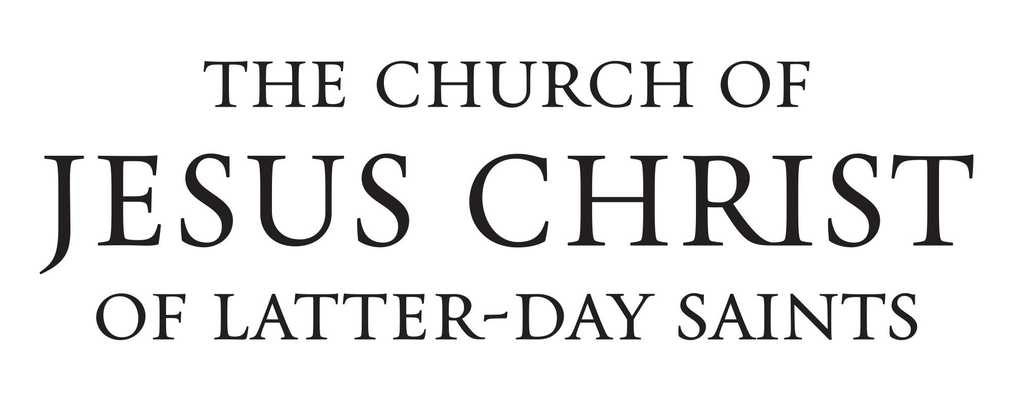
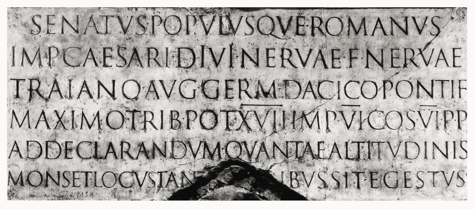
The typeface, Deseret, was custom-designed for the logo and reportedly drew inspiration from the inscriptions on Trajan’s Column in Rome. According to Magleby, this font was chosen "to look nondesigned — as it might appear on a building at the time of Christ — rather than modern."
This iteration of the logo appeared on everything from missionary name tags to official publications to meeting houses to General Conference broadcasts. It reinforced the Church’s identity as a Christian faith and its commitment to centering its message on Jesus Christ.
2020–Present: Subtle but Significant Update
In April 2020, the Church introduced a refined version of its wordmark to go alongside a Christus logomark. Together, these elements make up a "combination mark."

The 2020 logo maintains the emphasis on Jesus Christ while making subtle but significant improvements for a world where most people now encounter the Church online rather than on a building sign. The typeface was refined for better readability on screens of all sizes—from smartphone apps to social media profiles.
Additionally, the updated logo introduced a more dynamic color palette. While the 1995 version was traditionally rendered in black or white, the new design allows for various color applications.
This version is also particularly adaptable across languages. The Church now publishes content in over 100 languages, and the 2020 design maintains its visual integrity whether displayed in English, Japanese, Arabic, or Russian—no small feat when you consider the vastly different writing systems involved.
A Logo That Tells a Story
The evolution of the Church’s logo is more than a design progression—it reflects the Church’s growth, priorities, and doctrinal focus.
In the early days, the Church didn't need a logo because most members knew each other personally. By the 1970s, a standardized logo helped create unity across an increasingly diverse membership. The 1995 redesign emphasized Jesus Christ. And the 2020 update optimized this message for a digital world where first impressions often happen on a smartphone screen.
Like Mormonr? Sign up for our newsletter to receive updates on the latest blog posts, Q&As, and Mormonr projects.